Data data data –are you analysing it or what?
You know what’s fun?
Analysing data – that’s what!
You know what’s not fun?
Spending hours and hours of time ‘analysing’ data, when all you‘re actually doing is reshuffling and changing columns, names, rows, dates, data types and any other number of errors just so you can do the analysis. All you really want to do is make some sense of your data and make a pretty graph or two so that you can show all your friends. Getting to this ‘fun’ step however, generally takes a lot longer than it should.
Years ago I was working in a project where we were collecting milk production data from a large number of farms. It was all on a paper based system and it seemed easy enough; you know ‘farmer ID’, ‘cow ID’, morning milk production + evening milk production and the date.
Easy right? … Right?
Well, no! The ‘date column’ turned out to be the bane of my existence for several months. You see, in the field we had two field assistants collecting data, these two guys then handed their field books over to two office staff who then diligently entered the data into two separate computers. Despite my efforts to mitigate the risks associated with confusion around how the date should be collected and entered; there was still a problem in how they ended up in both computers. Sometimes it ended up as ‘dd/mm/yyyy’ and others ‘mm/dd/yyyy’. The confusion occurred in two places, sometimes on the paper itself and the other was that each of the computers had different date settings. Hence, when I combined the data sets, it was….to say the least….a mess.
There were a number of key lessons in there for me, and a few tips I could give my younger self to make fixing that data set much easier. However, at the time, with no ‘R’ data processing skills, I had to rely on persistent dedication (along with an extra set of eyes from a little helper) to meticulously go through each cow’s lactation and find the errors and correct them manually. Painful, slow and most importantly detrimental to the momentum of the project!
Anyway – this little story isn’t to disclose my lack of data processing skills at the time or how I could have managed it better. It is more so to highlight that although data entry errors like this are commonplace – in this day and age, I could have potentially saved months of work by utilizing available tools that would have essentially circumvented nearly all the issues I had in this data collection process. Off-the-shelf apps for your phone/tablet are available and they aren’t too expensive, even a simple one would have helped me significantly in our project. Since this experience I have seen two PhD students use a very cheap and easy to learn survey based apps to build their project questionnaires, implement their field work and then download their data for analysis. When I saw the data sets from their research come in, they were beautiful!
Perfectly rectangle.
Each column consisted of only one data type.
And the ‘date’ all lined up and in the same format.

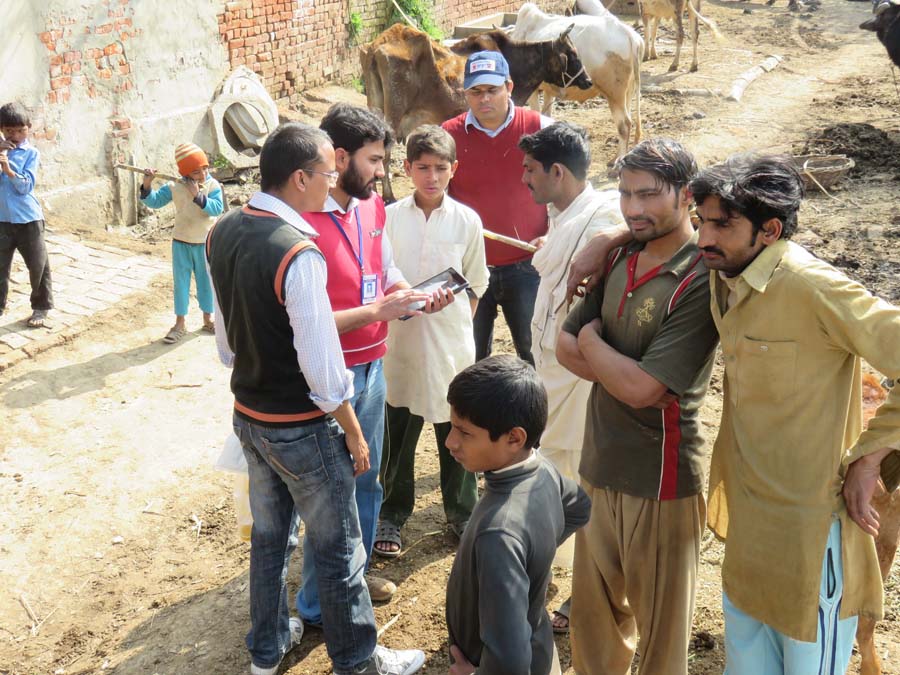
Picture: One of our team members in Pakistan using a tablet to collect data using an off-the-shelf app for a digital survey built by one of PhD students.
Spare a thought to the person who analyses your data. Whether that be yourself, your boss, a student or your friendly neighborhood stats guy/girl, the type of data set that comes from the output of a tablet based survey app is an absolute blessing. They are neater, cleaner and most importantly much MUCH easier to make pretty graphs with. Compared to some of the ‘colourfully’ organized data sets that I have seen, where things are all over the shop and it takes 80% of your time to get it ‘stacked’ appropriately for graphing and analysis – the app survey data sets are simply a statistician’s dream.

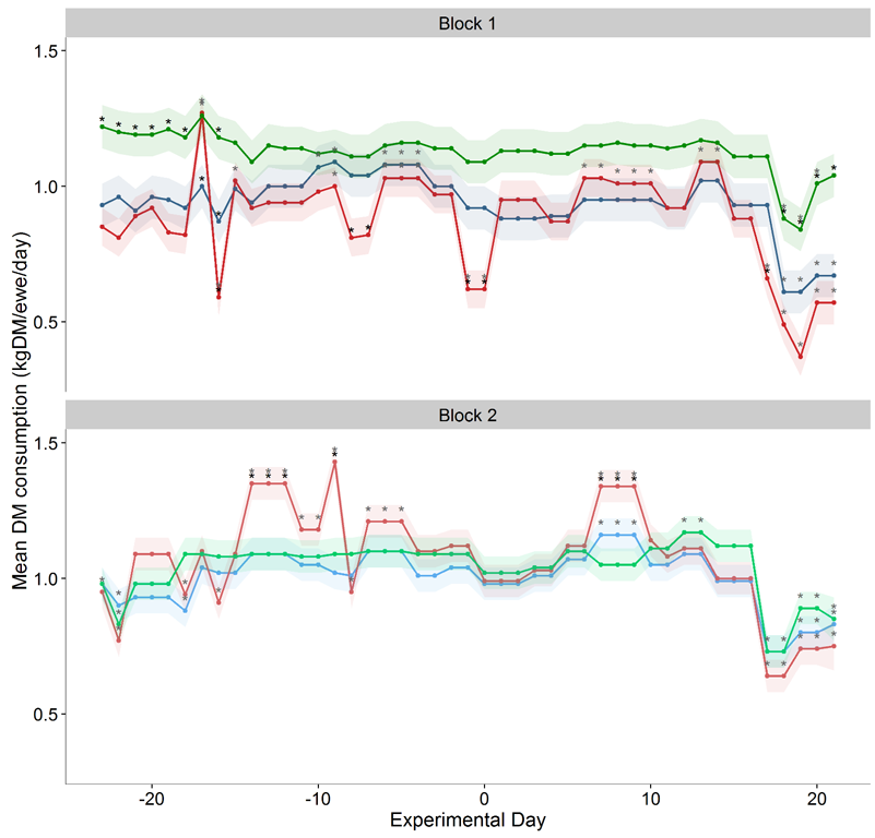
Picture: A ‘pretty graph’. This is not here to highlight what the graph is telling us (I have purposefully removed the legend so it doesn’t ruin the surprise when it gets published), it’s just here to show us how much we like looking at ‘graphs’ (provided by one of the most promising ‘R’ graphers I know).
For majority of the work that we do overseas in research for development and agricultural systems, the challenges associated with data collection are exacerbated by language, the timing we have for implementation in-country and the short visits which lead to short training turnarounds. In these cases, apps provide some real solutions to minimizing data collection errors, improving data quality and providing an innovative way of collecting data and training your team in the process. These apps however are not a silver bullet and they come with their own challenges. Anyone keen to jump into the world of digital data collection should check out some reading on it or get in touch with a research group that has experience in it, because it can be a minefield when it comes to hardware, the apps available, connectivity, ethics implications, data usage and data management (see project report link below).
One of the first questions that people often ask is about the costs involved in getting started. This is extremely important as many of us are working in research and development projects where resources are limited. I’m not going to advocate that you dip your hand in your funding pocket and fork out everything you own to buy the most expensive app software. I will say that there are some very useful cheap options available and even though the more complex apps might cost a little more, the added features they provide are extremely valuable and give you a range of data collection options (eg; video/picture/GPS) that make your data capture easier, more detailed and of greater quality!
The last thing I will say about costs comes back to your friendly neighborhood stats girl/guy. Think about them for a minute. If they’re going to spend 3 months (or 6 months as I did), fixing a messy and disorganised set of excel spreadsheets consisting of somewhere between 10% and 30% data entry errors; wouldn’t it have been better to fork out some money in the first place so they could spend their time doing an actual statistical analysis and making pretty graphs instead?
David McGill has been working on an ACIAR funded research project, managed by Agricultural Impact International. If you have any further enquiries please feel free to contact David McGill (dmcgill@unimelb.edu.au), Stuart Higgins (stuart@agimpact.org) or Jack Hetherington (ACIAR, jack.hetherington@aciar.gov.au). To get a better understanding of some of the findings of this research work and the apps that were evaluated within an ACIAR project context, please take a look at the research report (http://aciar.gov.au/publication/fr2016-03).

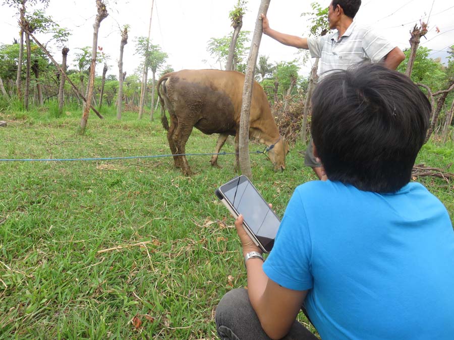
Picture: One of our field team in Bali preparing to take a photo with her tablet to link with her survey data. This photo was taken during the ACIAR funded app comparison project described above


